
With all the hand-wringing over whether or not the August lows will hold, this is the least of bulls’ worries. Bigger challenges probably lie ahead.
Of the big four – the S&P 500 index, the Dow Industrials, the Nasdaq composite, and the Russell 2000 index – it is the latter that has so far undercut the August 24th low, although ever so slightly. Regardless if the other three undercut those lows before stabilizing or find their footing right here is probably a moot issue. A bounce/rally is coming near-term.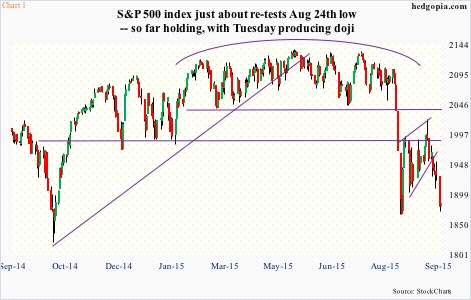
The 3Q earnings season begins soon, and the bar is low. At $28.66, sell-side operating earnings estimates are $2.36 lower than in February, as well as versus $29.60 last year. Stocks have been under pressure since they reversed intra-day post-FOMC decision on the 17th. On a daily basis, conditions are beginning to get oversold. Tuesday produced a daily doji on the S&P 500 (Chart 1). The odds of a bounce/rally are decent. Whether this sustains into strength medium-term remains to be seen – an uncertainty that pales in comparison to what could be brewing.
The vicious selling in August has wrought technical damage to the afore-mentioned indices, plus others. In more ways than one, this was months in the making, although it felt like it came out of nowhere. The S&P 500, for instance, suffered a monthly MACD bearish crossover as early as April – a rare occurrence in and of itself. The index peaked at 2135 in May. The last two bear markets were preceded by MACD crossovers as well – in December 2007 and February 2000. So yes, this should be on bulls’ long-term worry list.
As should Chart 2. There is one more session to go this month, and the S&P 500 is on the verge of dropping below its 20-month exponential moving average. As is the case with the afore-mentioned MACD crossover, this does not happen often. The last time this occurred was in August and September of 2011. And as is the case with monthly MACD crossover, this also preceded the last two bear markets.
Then we have Chart 3, which is as of August. Hence the red line does not capture the month-to-date 4.5-percent drop in the S&P 500. More important is what the green line is saying. It is the ratio of NYSE margin debt to its 12-month average. Margin debt peaked at $507.2 billion in April. August was $473.4 billion. Not surprisingly, sustained deceleration is not stock-friendly. That is what the green line seeks to capture. Once it sustains below one, margin debt no longer becomes a tailwind, which is what we saw in late 2000 and 2007 (circles in the chart). In August, the ratio dropped below one, although barely. With stocks under pressure again in September, it is probable the ratio continues lower this month – another of those developments that should be on bulls’ long-term worry list.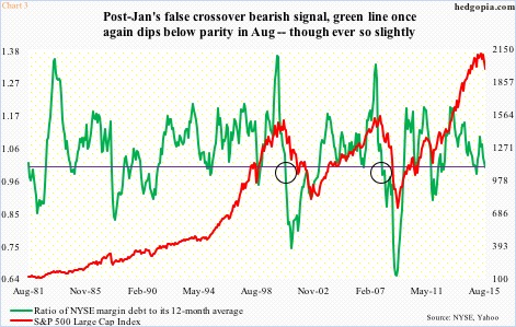
Historically, once any of these signals is triggered, over time stocks tend to come under sustained pressure. Will they come true this time? Mindful of the fact that central-bank activism is alive and well, a fitting question would be ‘what if?’. What if they come true? Any bull market that has gone on for six-plus years can be expected to have excesses built in. This one does too. Unwinding of ‘too much of a good thing’ can be painful. Below are four examples of such excesses.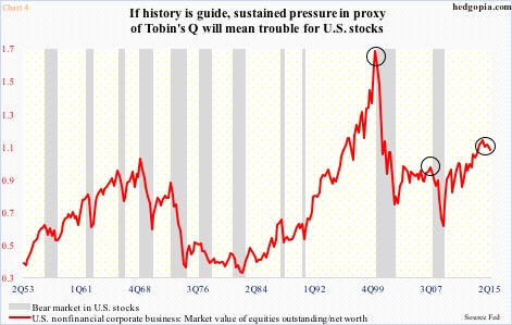
The red line in Chart 4 is a proxy of Tobin’s Q, which is the ratio of a company’s market value to the replacement value of its assets. For our purposes here, the market value of equities outstanding of U.S. non-financial companies and their net worth is used (in 2Q, they were $22.1 trillion and $21.4 trillion, respectively). The ratio has been north of one the past eight quarters, and in the current cycle peaked in 2Q14 at 1.09 – the highest since 1.64 in 1Q00. Two things are worth noticing. First, it has hooked down (2Q was 1.03), and second, it is doing so from a relatively high level.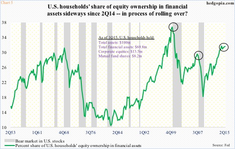
Probably also in the process of peaking is the green line in Chart 5. It shows U.S. households’ equity ownership in financial assets. Despite all the talk we hear about bear market-burned retail investors yet to go all in, households in 2Q held 31.2 percent of their financial assets in equities – slightly below 31.3 percent in 2Q14. The cycle high a year ago is second only to 36.4 percent in 1Q00.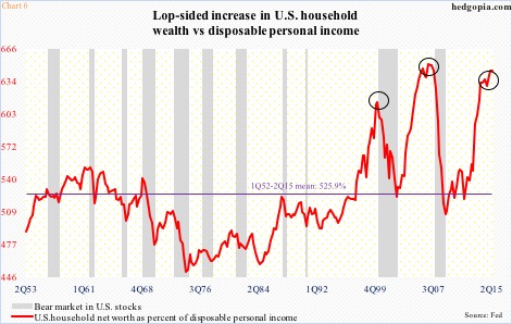
Staying with households, if we just focus on their net worth, the picture could not be brighter. In 2Q, net worth was $85.7 trillion. But then again what looks good on an absolute level may not do so on a relative basis. When we compare net worth with disposable personal income – $13.3 trillion in 2Q – we see how lopsided the increase has been in the former. In 2Q, net worth was 6.45 times disposable personal income – second only to 6.51 times in 4Q06 (Chart 6). Stocks do not like once a process of unwinding begins.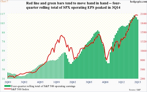
This is even more so when it comes to earnings growth – or a lack thereof. In Chart 7, the S&P 500 is pitted against the four-quarter rolling total of operating earnings for its constituent companies. The green bars peaked in 3Q14 at $114.51 and by 2Q15 were $6.20 lower. Primarily due to energy, estimates for this year have collapsed to $111.08 from as high as $137.52 at the end of 2Q last year. Ironically, 2016 estimates in February this year were $137.46 and have since dropped to $129.45 – still expected to jump 16.5 percent over 2015! If next year’s estimates look high – and in all probability they are – watch the red line. The correlation coefficient between the two variables is .9. They move in tandem. And worth a close watch.
How Charts 2 and 3 evolve can have repercussions for Charts 4, 5, 6 and 7, and hence for stocks.
Thanks for reading!
