
NYSE margin debt fell again. June was down $3.8 billion month-over-month to $447.4 billion. Since it peaked in April last year at $507.2 billion, margin debt is now down $59.8 billion – or 11.8 percent from the peak. The S&P 500 large cap index went from 2086 to 2099 during the period – essentially flat. What gives?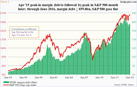
If we go back to January 1980 and calculate correlation coefficient between margin debt and the S&P 500, R is near perfect 0.96. It is also visually seen in Chart 1, except on the far right. Indeed, between April 2015 and June 2016, R was reduced to zero.
There is a similar divergence taking place elsewhere.
The 12-month rolling total of foreign purchases of U.S. equities was $7.9 billion in February 2015. In May this year, this stood at minus $134.1 billion. Granted the two have diverged for three years now, divergence has gotten starker since the early months of last year (Chart 2).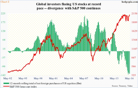
Or this! Since the February 11th low (this year) through the July 20th intra-day high, the S&P 500 rallied 20 percent. Amazingly, nearly $57 billion has been withdrawn from U.S.-based equity funds during the period. Stocks have not flinched.
As they say, records are meant to be broken. Or, in this case, relationships are meant to be broken.
Importantly, might the breakdown in relationship in question be temporary or permanent? Margin debt, or the amount borrowed to purchase securities, is a source of buying power. Any decline therein will have to be offset by an increase somewhere else. Otherwise, this would negatively impact stock prices. Simple math.
The rub is, it is hard to put finger on what other sources of buying could be replacing the shortfall in margin debt. Some stealth buyer? Invisible hand?
Alternatively, the hesitancy on the part of traders/investors to buy on margin in a rising market environment is probably just be a reflection of the prevailing risk-off attitude.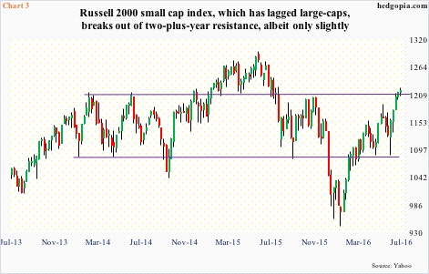
Yes, stocks have done well since February, and particularly since the June 27th post-Brexit low, but small-caps have lagged their large-cap brethren. While both the S&P 500 and Dow industrials have broken out to new highs, small-caps (Chart 3), techs, and transports are yet to do so.
The Russell 2000 small cap index (1217.33) rallied north of 12 percent since the June 27th low to test resistance going back to March 2014. It has even managed to break out – meekly at that – and is now overbought on both a daily and weekly chart. It probably would be hard to sustain the breakout – at least near term.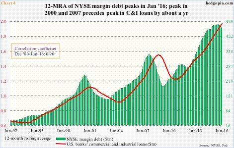
Speaking of divergence and broken correlation, it will be interesting to see what in due course becomes of what historically has been a strong correlation between the red line and green bars in Chart 4. In both 2000 and 2007, margin debt led U.S. banks’ commercial & industrial loans by about a year. This time around, the green bars peaked in January this year. The red line is yet to do so, and still going strong. If past is prologue, it should begin to peak in 1Q17. Assuming correlation between the two is still intact, that is.
Thanks for reading!
