
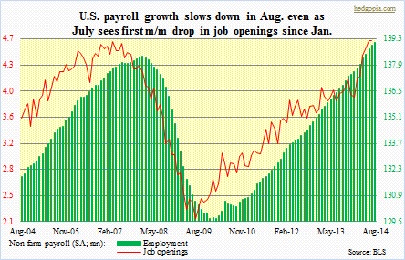
 Remember the August payroll report, which came in much weaker than the consensus was expecting? After six consecutive months of 200k-plus (April in fact was 300k-plus) jobs, August produced a mere 142k. Across the board, economists quickly brushed it off saying it was just one-off. After all, as have been discussed on this blog, job openings have been very healthy. From this perspective, the August report did look like an aberration. Until Tuesday, when the Bureau of Labor Statistics published the JOLTS survey for July. Job openings nudged lower month-over-month. This was the first time since January that the series saw m/m deceleration. A couple of points. First of all, the survey only goes back 2004, so there is not much historical data to base one’s judgment on. Secondly, as can be seen in the accompanying chart, in March 2007 and July 2009, ‘job openings’ did indeed lead payroll. One month does not make a trend, but after the sharp spike beginning January on the right side of the chart the red line seems to want to go flat. Now, this does not mean payroll is going to weaken right away. Once again, if the job-openings data that were reported in prior months are any indication, payroll should continue to post decent numbers in the next several months. What happens after that depends on how ‘job openings’ come in now. July was a disappointment, to say the least. Hopefully an aberration. If not, watch out for payroll weakness in outer months.
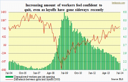 The good thing is, employees are still quitting – shows they are gaining confidence in their ability to find a job. But even on this front, some caution flags are going up. The red line in the adjacent chart reflects the difference between non-farm ‘quits’ and ‘layoffs and surcharges’. Not surprisingly, the metric bottomed in April 2009 and has since moved up. From the perspective of a job seeker, the higher the number, the better. Having said that, it peaked in November last year and has since been vacillating, essentially going sideways. The culprit? The quits component is still trending higher – 2.52mn in July, versus 2.31mn year-over-year. But ‘layoffs and discharges’ are flat over the same period – 1.66mn, vs. 1.67mn. Indeed, as per Challenger, Gray & Christmas, job-cut announcements are no longer falling (not shown here). The four-quarter running total in 2Q14 was 496k, up slightly from 485k quarter-over-quarter. These cuts are still at/near cycle lows, even though in recent months they are either flat or have nudged up ever so slightly. And that is what is causing the rather flattish looking red line in the chart.
