
May’s jobs report out last Friday gave us a glimpse into how U.S. job creation has been in gradual deceleration. Now we have the latest JOLTS report that is pointing us toward a possible inflection point.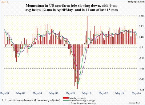
To refresh, a mere 39,000 non-farm jobs were added in May, with downward revisions to the tune of 59,000 in March and April. In the last three months, job creation averaged 116,000, versus 170,000 in the last six, and 200,000 in the last 12.
As is seen in Chart 1, the six-month average has crossed down below the 12-month, and has remained that way in 11 out of the past 15 months – a sign of decelerating momentum.
That said, one could always point to job openings to show how healthy the pipeline is. Job openings do lead payroll, both into and out of recovery.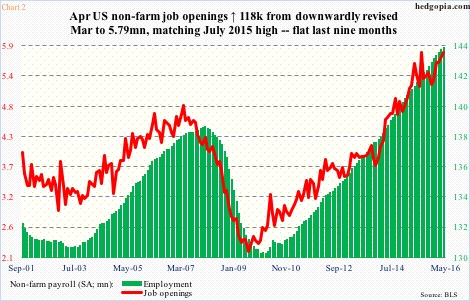
The green bars in Chart 2 continue to rise, although, as is seen in Chart 1, the rate of growth has been in deceleration. The red line, however, may be beginning to lose momentum. At least it seems that way.
Non-farm job openings peaked at 5.79 million in July last year, then dropping all the way to 5.2 million by November. When April numbers were out this week, March was revised lower by 90,000 to 5.67 million, enabling a month-over-month increase of 118,000 to 5.79 million in April – meaning openings have gone flat the last nine months. This could very well be a sign of waning momentum in openings. We will see.
Ironically, the ratio of job openings to unemployed looks very healthy. April’s 0.73 matched the reading in May 2001 (Chart 3).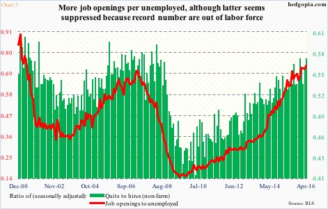
However, there is this to consider.
It is possible the red line in Chart 3 is messed up due to the 94 million people that are out of the labor force (Chart 4).
In May, there were 7.44 million unemployed, down from 7.92 million in the prior month, for a reduction of 484,000, which pushed the unemployment rate down to 4.7 percent from five percent (household survey). All good, except there were 664,000 fewer people in the labor force. The latter stood at 94.7 million, which has steadily risen from 80.9 million in June 2009.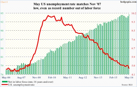
In other words, the headline unemployment rate probably does not truly reflect the true picture in U.S. employment… the implication being the signal coming from the red line in Chart 3 may not be as reliable as in past cycles.
Chart 3 also plots a ratio of quits to hires. The premise is simple. People quit when they are confident of finding a new job with relative ease, which should be the case in a healthy job market. Measured this way, it is still a healthy market.
In April, quits were 2.91 million, down 36,000 m/m. This was up from 2.68 million people a year ago. However, the recent trend in quits is not going the right direction. They peaked at 3.09 million last December, and have since gone sideways to slightly down. The ratio, at 0.57, has been flat since last December. Along the same lines, hires were 5.09 million in April, down from 5.51 million in February.
These are confusing times. Not all the jobs-related data are in sync. Non-farm payroll, for instance, is not in agreement with unemployment claims, which are at/near multi-decade lows. We need more data for confirmation. Or, this may just be a sign that things are at an inflection point.
Thanks for reading.
