
Last week when the Federal Open Market Committee (FOMC) met, market participants were divided as to whether or not the Fed would raise rates. Most economists expected a hike, as did the short end of the yield curve; two-year Treasury yields had shot up to 0.82 percent into the meeting. Fed funds futures, on the other hand, were pricing in low odds of a hike. Even among FOMC members, the difference in opinion was stark.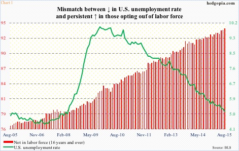
One reason for this dichotomy is the prevailing wide divergence in economic data. Those particularly focused on consumer inflation were rooting for the status quo to continue. Those looking at the unemployment rate, however, were expecting a tightening cycle to begin. Even within employment, the dovish camp could cite the large number of Americans not in the labor force as a reason not to hike, while the hawks could point to a tightening labor market, which was evident in the persistently declining unemployment rate (Chart 1).
There will be a rate hike, as rates cannot go any lower, unless they go negative. This is not up for debate. The only question is when. What is probably not up for debate is this. Unlike in the past when once a tightening cycle begins, it persists for a while – both magnitude and duration – this one has the potential to be a shallow one. The most common arguments for this include an economy that continues to act tentative. Not to mention the fact that emerging economies/markets look vulnerable to rate shocks. But there is an even stronger case for a shallow tightening cycle.
In Chart 1, the green bars represent the federal government’s interest payments. Back in 4Q08, even as the fed funds rate was pushed down to near zero, interest payments were less than $336 billion (at a seasonally adjusted annual rate). Seven years on, zero interest-rate policy (ZIRP) is still in place, but interest payments rose to north of $457 billion in 2Q15 (Chart 2).
What gives? Debt is the simple answer.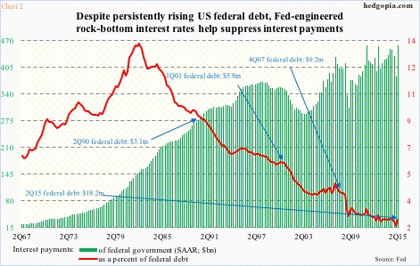
In Chart 2, the red line represents interest payments as a percent of federal debt, and has been under pressure since the early ‘80s. That was when U.S. interest rates peaked. In 2Q82, interest payments made up 14 percent, and federal debt stood at $1.1 trillion; in 1Q15, the former dropped to 2.1 percent, even as the latter soared to $18.2 trillion. Since 2Q90, there have been three recessions; federal debt has grown six-fold since.
The situation is turning into a Catch-22. The U.S. economy is increasingly reliant on debt. Chart 3 plots year-over-year change in nominal GDP and credit market debt outstanding, with an R of 0.64 between 1Q53 and 2Q15. As goes the red line, so goes the green bars.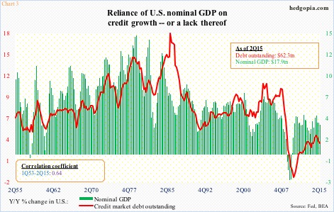
No doubt, there has been improvement in the federal budget deficit. In February 2010, the 12-month running total came in at $1.48 trillion, even as the Treasury issued $1.63 trillion in Treasury notes and bonds; most recently, the former dropped to $488 billion in July and the latter to $622 billion in August (Chart 4). Nonetheless, the nation still runs a deficit. This in the midst of a recovery, no matter how tepid.
Debt continues to grow, and does not look like a trend change is coming any time soon. Come October, the debt ceiling will be raised again.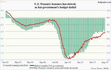
Hence the importance of Chart 1. In 2Q15, interest payments were 2.52 percent of federal debt. Let us assume for a moment that the Fed does indeed get on a tightening cycle and in due course the red line rises by a full percentage point. Then we are looking at $639 billion in interest payments, versus $457 billion in 2Q15 – for a difference of $182 billion! No chump change. In 2Q15, federal taxes on corporate income were $448 billion (at a seasonally adjusted annual rate).
ZIRP is helping suppress interest payments on government debt – 2Q15 was unchanged from 2Q11, although debt grew by nearly $4 trillion. The Fed would not want to rock this boat.
Thanks for reading!
