
Last Friday, spot West Texas Intermediate crude ($41.62) produced what looked like a shooting star near its 200-day moving average ($42.77). Right above lied another layer of resistance at $43.50 going back to January 2015 (Chart 1).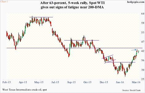
A shooting star is a potentially bearish reversal signal, and has shown up in spot WTI’s chart after a relentless rally off the February 11th low during which the crude surged 63 percent.
Crude oil has been able to put up this performance in the midst of persistently rising U.S. inventory. In the week ended March 11th, stocks rose by another 1.3 million barrels to a record 523.2 million barrels. Inventory is now up by nearly 41 million barrels in the past 10 weeks.
But markets currently seem focused on the positives.
In the said week, gasoline stocks fell by another 747,000 barrels to 249.7 million barrels. In the past month, stocks have shrunk by nine million barrels, although from a record high.
Similarly, crude production fell by 10,000 barrels per day to 9.1 million barrels per day. Production reached a record 9.61 mb/d in the June 5th (2015) week.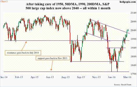
Of late, U.S. stocks have shown strong correlation with crude oil. Both bottomed on February 11th.
If oil heads lower – if nothing else just to unwind overbought conditions – would stocks be able to break the prevailing correlation and go on its own merry way? Remains to be seen.
In the past five weeks, however, stocks have done exactly that in more ways than one.
When the current rally started on February 11th at 1810, having just suffered a collapse, it was difficult to imagine the S&P 500 index (2051.6) trading north of 2040 in five weeks. Yet, that is what has happened. The index has rallied north of 13 percent.
In the process, resistance has fallen like dominoes (Chart 2).
First, 1950 went down on March 1st, concurrently breaking out of the 50-day moving average. Then went 1990, quickly followed by the retaking of the 200-day moving average.
Last Friday, bulls took care of 2040, where three different resistance converge: horizontal line going back more than a year, January 2016 gap-down, and November 2015 declining trend line.
Throughout all this, stocks in general have remained in overbought territory on a daily basis, even as weekly indicators are very close to entering overbought zone. All this has been achieved without much help from fund flows.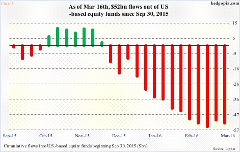
In Chart 3, flows into U.S.-based equity funds have been calculated from September 30th last year as that date approximates the low post-August/September decline. Equity funds have lost $52 billion since.
In the week ended March 9th, $4.6 billion moved into these funds – first inflows in 10 weeks. Turns out this was a one-off. A week later (by the 16th), there were $2.1 billion in outflows (courtesy of Lipper). Since the week ended February 10th, nearly $10 billion has been withdrawn. (The S&P 500 bottomed on February 11th.)
It is possible traders are resorting to margin debt. February’s numbers will be published later this month; March is a long way off. So we would not know for some time if margin debt indeed is contributing to the rally.
NYSE margin debt peaked last April at $507.2 billion. The S&P 500 peaked the following month at 2135. This January, margin debt dropped to $447.7 billion. The downtrend since the April 2015 peak has meant the green line in Chart 4 has remained below parity for six months in a row. The line is a ratio of margin debt to its 12-month average… in the past, persistent decline has brought bad news for stocks.
Assuming margin debt was up in February/March, would that be enough to nullify this signal? Remains to be seen.
What we do know is this.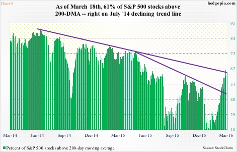
Last Friday, 61 percent of S&P 500 stocks were above 200-DMA (Chart 5), with potentially plenty of room to rally before the green bars get into extended zone. Currently, they are sitting right on the July 2014 declining trend line but above the May 2015 trend line.
What could come in the way?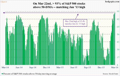
Chart 6 shows S&P 500 stocks above 50-DMA. Last Friday, it spiked to 93.4 percent, matching the high on January 22, 2013, and was unchanged yesterday. The all-time high was 94.2 percent in June 2003. This metric is absolutely running into a wall.
At this juncture, it is probably safer to bet Chart 6 beginning to retreat than on Chart 5 proceeding to decisively break the July 2014 trend line and on to greener pastures.
Chart 7 in this regard could be very relevant here.
The VIX to VXV ratio last Friday dropped to 0.782 – the lowest since mid-March last year. VIX measures the implied volatility of S&P 500 index options over the next 30-day period, while VXV does the same but goes out three months.
When VIX is dropping faster than VXV, shorter-term volatility is getting crushed, hence higher stock prices, which has been the case since stocks bottomed first on January 20th and then on February 11th.
As Chart 7 shows, a drop into the 0.70s significantly raises the odds of a reversal, which, if pans out, means demand for VIX would rise, as market participants rush to buy protection near-term. Occasionally, there have been times in the past in which the ratio has gone even lower, but risk/reward favors betting on the ratio rising from here.
This also suggests the bars in Chart 6 will begin to shrink, and those in Chart 5 remain held by that declining trend line.
Thanks for reading!
