
 The sun always rises in the east and sets in the west. But in life, things are not always this straightforward. Besides black and white, there is this thing called gray. And in the gray territory, things can get confusing. Depending on one’s point of view, two sane people might be looking at the same thing and can logically come up with two different analysis/conclusion. The stock market – or any other market, for that matter – is one example. It is not uncommon for a bear and a bull looking at the same set of data and analyze it in a way suiting his/her own bias. In fact, this is what makes a market. There is a bid for an ask. There are put buyers/call sellers and there are call buyers/put sellers. There are optimists and there are pessimists. And on and on. The point is, a layman in particular will have a hard time separating the wheat from the chaff. One such issue relates to if the expansion in the Fed’s balance sheet since late 2008 has had a direct impact on US equities. As we all know, their assets have expanded from $473bn in September 2008 to $4.2tn now. The S&P 500 Large Cap Index was under 1300 back then, dropped below 700 by March 2009 and now sits at just north of 2000. There are professionals who think the Fed has everything to do with the surge in stocks, and there are others who think exactly the opposite. We were faced with one such moment this Saturday.
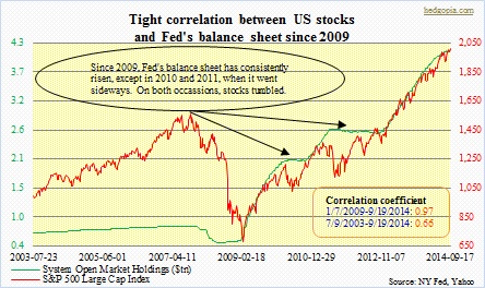
 The stage was the weekly Masters in Business show on Bloomberg Radio. Barry Rithotz was the host, and Jeffrey Saut, chief strategist at Raymond James his guest. Let me first get this out of the way. I have very high regard for both these professionals. Jeff is one of those who is as versed in technicals as he is in fundamentals, among others, a rarity among strategists, and which, as far as I am concerned, gives him an edge over his peers. His weekly Investment Strategy is a must-read. So is Barry’s The Big Picture daily blog. It was an educational and nicely done interview – I suggest downloading the podcast. In the conversation, the issue of Fed assets came up. Barry brought up the issue, suggesting the rally in stocks is not driven by the Fed’s money-printing (I am paraphrasing, of course). Jeff concurred, instead pointing out the surge in corporate profits. Confused as I was, I decided to do some homework. The result is the chart on top. You be the judge – whether or not the Fed has played an instrumental role in the surge in stocks.
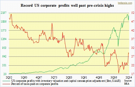
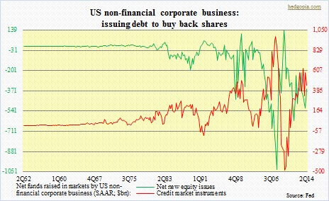 As far as I am concerned, the correlation between the two variables is way too strong to pass over. From the start of 2009 to the present, correlation coefficient is .97. That is as good as one — perfect correlation. The R does drop to .95 when we push back the start date to 9/24/2008; that was when the Fed’s assets grew from $473bn to $480bn week-over-week, before persistently marching higher. And correlation drops to .66 when the data is pushed back further to July 2003 (that is how far back SOMA data goes). And it is visible in the chart. There is not much correlation up until 2009. Further, in 2010 and again in 2011 the Fed’s assets flatline, and stocks act like a drug addict denied of daily dose. The S&P 500 tumbles 17 percent in 2010 and by 22 percent in 2011. Now, there is no denying the fact that corporate profits have simply gone through the roof. The middle chart gives us an idea by how much. In addition, the earnings-per-share metric has gotten further boost from aggressive share buyback by corporations.
But here is the thing. The last time the S&P 500 corrected 10-percent-plus was in June 2012, and the index has surged nearly 60 percent since. In any market, it is normal to correct. As a matter of fact, it is healthy – to get a little taste of fear every now and then, which helps build a strong base. But it is greed that is driving investor psyche right now. Utter lack of fear — for the most part anyway. At least going by the chart above, the Fed plays a crucial role in this respect. The QE program, and the Fed’s assertion about the benefits of the wealth effect, is a signal to investors to get on the risk curve and stay there. Probably the reason why there is such a tight correlation between the Fed’s assets and stock performance. The question is, now that the Fed will be done with its current QE by October, would US stocks take cue from 2010/2011 and begin to act sick or begin a new era in which the hitherto correlation breaks? Fingers crossed.
